7.10 Breaking the Rules
In some cases, we know that book men chose to substitute other sorts of emblems on title pages. Famous authors could command the addition of their personal devices up front, in which case the printer's mark might stand in a secondary place, at the end of the book or on the verso of the title. Learned academies placed their institutional emblem on title pages, similarly banishing or displacing the printer's mark. But even relatively unknown textbook authors, when they were in control of the process of printing, could do the same.
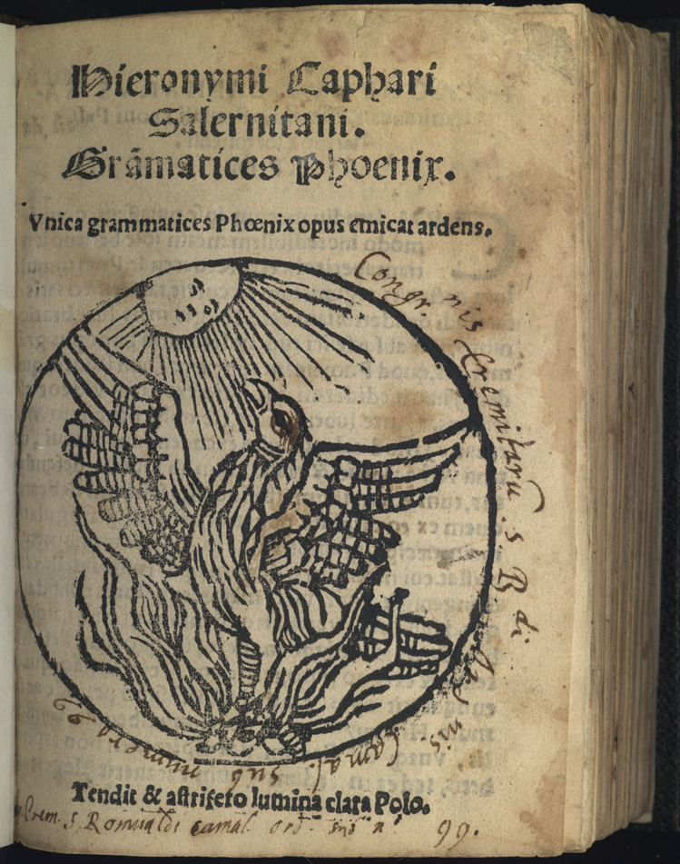
One such book to survive from the sixteenth century is the product of a provincial schoolmaster and a provincial press, the Grammatices Phoenix by Girolamo Cafaro (d. after 1564), printed at Cortona in Tuscany in 1546. Cafaro was a native of Salerno who proposed a radically simplified Latin grammar course. The book had considerable success, since it went through more than twenty subsequent editions and was printed as late as 1607. (32) Cafaro intended the phoenix in his title to suggest that his new grammar would replace those of older-fashioned pedagogues; and he emphasized the point on the title page of the first edition with an emblem, apparently cut to order by an unskilled local craftsman. It shows a phoenix rising from the flames and facing the sun with a motto, "It strives toward the clear light in a star-producing heaven." (33) Cafaro, at this date a minor figure anywhere but in Cortona, could only have commanded this degree of consideration from a provincial printer; and the roughness of the cut suggests that the printer could only secure the services of a local artisan.
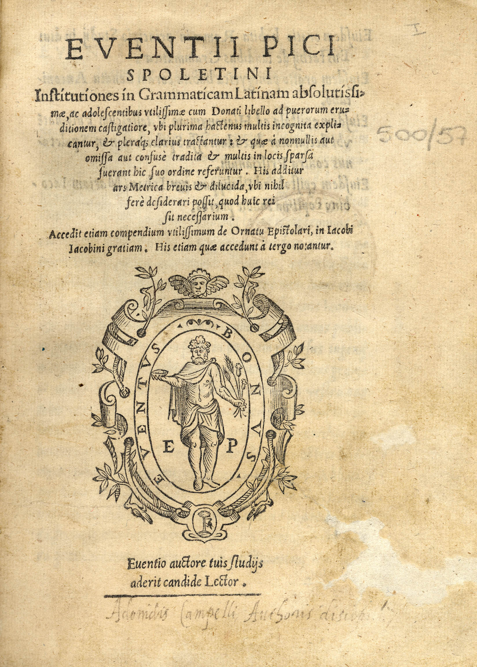
If a school master had the means to subsidize the publication of a textbook entirely by himself, he could also dictate the title page design to include his own personal mark. Evenzio Pico, a grammarian who taught at Ancona, turned to Antonio Blado in Rome for a beautifully designed elementary grammar that appeared in 1560 together with some shorter works --letters and orations-- authored by Pico. Although Blado used somewhat worn type, the format and layout are spacious and handsome, entirely up to the design standards of his firm. Most remarkable of all, however, is the large, fresh woodcut emblem on the title page. It is a personal mark, not a family crest, since it plays on Evenzio Pico's unusual first name with a motto that reads Eventus Bonus, literally "a good result," also the name of the Roman god of success and fruitfullness. The extensive front matter of the book presents it as a gift from the author to his erstwhile employers, the people of Ancona. It is unclear whether Pico intended this book as the capstone to a successful career or as a bid for re-employment in Ancona. But in any case it displays considerable vanity in offering his collected works behind a title page with a personal device. (34)
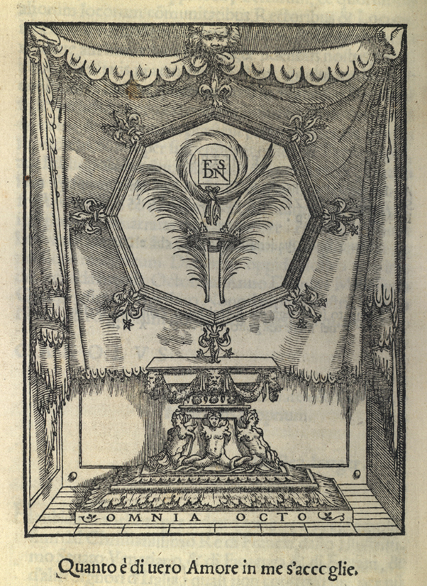
An even more upscale grammar book was that of Francesco Priscianese (d. ca. 1547), a humanist and printer who participated in the brilliant circle of Tuscan intellectuals that included Piero Vettori and Michelangelo Buonarotti. Like humble Cafaro, however, Priscianese proposed a radical restructuring of the grammar course (see above, sections 2.11 and 2.13). In 1540, he offered the first edition of his new grammar (written in Italian), with a mysterious, full-page emblem on the verso of the last page. In a draped niche, we see a jeweled monstrance decorated with fleurs-de-lis and, in the central field, two palm fronds encircled by a crown. Above them hovers a palm wreath tied with a ribbon that surrounds the letters F S D N. On the base of the monstrance is the motto Omnia octo ("All in eight," a proverb from the Byzantine writer Michael Apostolios), while the single line of poetry at the bottom of the page reads "Whatever of true love exists is received in me" (Quanto è di vero Amore in me s'accoglie). This is about as deliberately obscure as an emblem can get. Indeed, though beautiful, the image detracts from the advertised utilitarianism of the work by inserting it into a highly academic context.
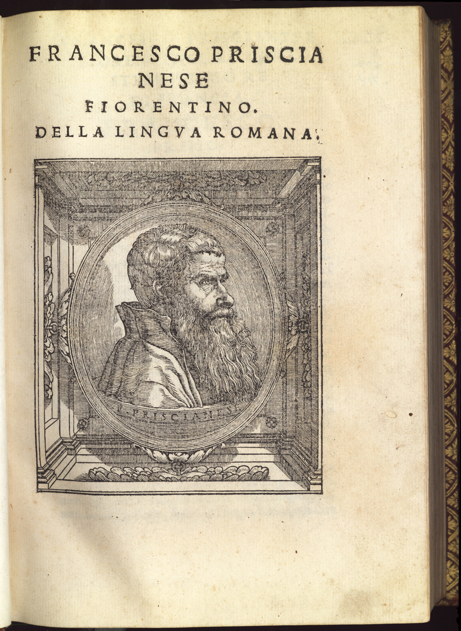
The book was pretentious in several other ways too. It appeared in a stout quarto format and included a woodcut portrait of the author on the title page. The portrait was apparently taken from life and done in a distinctively Florentine, high mannerist style. The dedication is to Francis I, King of France (to whom the emblem might refer, though it does not include any of his personal insignia); and the volume included full texts of privileges from Pope Paul III and Emperor Charles V. It made reference as well to additional privilegii amplissimi from the French king, the Venetian Senate, the governments of Florence and Ferrara, and "other lords of Italy." The name of the printer appears only on the second-last page in tiny type. (35)
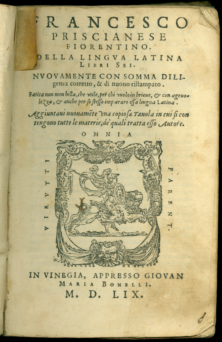
Priscianese presumably had considerable control over editions of his work that appeared in his lifetime, since, as a printer himself, he would have dealt with his Venetian publishers from a position of knowledge and prestige. It is interesting, therefore, that the subsequent editions of his grammar, all printed after the expiration of his initial privileges, do not include this emblem and omit the title page portrait as well. We do not know the exact date of Priscianese's death, but it seems that these later editions were done without his supervision. Or perhaps Priscianese simply yielded to the publishing conventions of the day that permitted printers and publishers to display their proud marks with emblematic messages of their own.
Girolamo Cafaro probably knew and imitated the grammar of Priscianese. At Cortona in 1546, as we have seen, he could only manage to elaborate his title page with a roughly cut phoenix emblem by a local artist. A second edition, done at Rome in 1555, was also called Phoenix, and displayed a new cut of the mythical bird, in every way more elegant and expertly done. An enlarged edition of the grammar appeared at Venice in 1560 where Cafaro transformed it again. The title Phoenix is gone, in favor of a more straightforward Hieronymi Caphari Grammatice. And the title page bears a woodcut portrait of Cafaro that seems to be a direct imitation of the Priscianese portrait of 1540. Presumably, Cafaro or his patrons were subsidizing these early editions, for they violated conventions of the day by using an original emblem or author portrait on a grammar book. All later editions (produced under commercial conditions at Venice, Rome, Pesaro, and Torino) bear ordinary printer's marks on their title pages. (36)
The cases of Priscianese and Cafaro were exceptions to firm, general rules. The fact that their personal interventions lapsed later demonstrates that there were clearly understood and rarely contravened conventions of title-page emblematics. Institutional publishers could intervene for good reason to displace the printer's emblem. Authors too could stretch the rules in cases where they were subsidizing the production of the books themselves; but they could not make anomalous usages last long in the competitive marketplace. Textbooks were a particularly traditionalizing form; and these two authors distorted the norm in the service of their radical educational ideals as well as for self-promotion. But in the larger textbook market, where learning was for sale, it was the publishers who made decisions.
NOTES
- Open Bibliography
- (32) Parenti 1973, 241; Grendler 1989, 192. Deutscher 2002, 1013 found five copies in the libraries of parish priests in the diocese of Novara in the seventeenth century.
- (33) Cafaro 1546: Tendit & astrifeto [sic] lumina clara Polo. This motto appears typeset below the image. It is unclear whether the corresponding words above are to be taken as part of the motto too; they read, Unica grammatices Phoenix opus emicat ardens.
- (34) Pico 1560. The photo of this very rare item is presented here courtesy of ANSAS (Agenzia Nazionale per lo Sviluppo dell'Autonomia Scolastica), Firenze. All rights reserved to ANSAS.
- (35) Priscianese 1540. Murray 1899, no.1589, records a 1545 quarto edition of the Priscianello, a digest of the lengthy original, which seems to have been adorned with the same emblem and author portrait. These cuts do not appear later in either the full or shorter grammar. Further on Priscianese, Grendler 1989, 186-187.
- (36) Further on author portraits, Zapella 1988, esp. 113-115; McGrath 2003, esp. 78-82; Casini 2004, 157-169.