2.05 Red and Black
For the Leto Cato of 1500 the De Gregori also employed the red-and-black style of printing, which had become common in Venice for some elementary schoolbooks. It is used to unusually good effect in this case. While many red-and-black books merely alternate the colors for purely decorative effect or to emphasize a few headings, the Leto Donat uses red ink in a much more complex way. Red is used for many of the words that are subjects of discussion in the question-and-answer sections. In discussing personal pronouns, for example, the student is given the words ego, nos, tu, and uos in red at the left margin and the questions and answers that concern them are in black just to the right. [fol. 21v] Similarly the conjugation of amo is displayed in several column-format paragraphs across three pages. A typical one begins with a black bracket to divide the verb tenses -- present, past imperfect, past perfect, etc. -- which are named below the bracket in black. Beneath each tense is the corresponding form of amo, also in black, but introduced by the word ut ("such as") in red. Below this diagram, each of the sample words is then repeated in red at the right margin, and in a separate column to the left are arranged the questions and answers to be drilled. Thus: "Amo [in red]: What is its tense? Present. How so? Because the present tense designates an action or passion." [6r-7v] These diagram-form paradigms are supplements to the traditional Donat, since the common Ianua-text of this section, rehearsing the conjugation of amo on an additional three pages, is also present. [8r-9r] In these sections giving the traditional text of Ianua, red ink is employed only for the first letters of paragraphs, a much more typical red-and-black usage. As a result, teachers familiar with the common teaching text could quickly and easily see the interpolated material in this edition; and students seeing it for the first time would also be able to discern that there are two sections that drill each major inflectional paradigm.
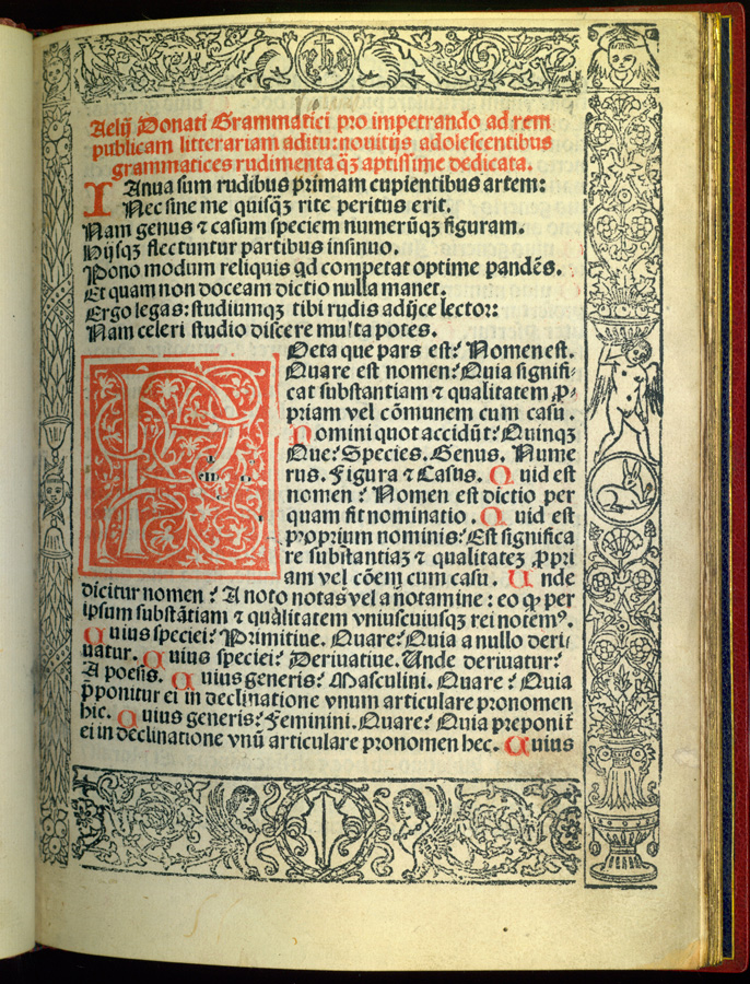
The practice of ornamenting in red and black has a complex history. (21) Most often used in the fifteenth century for liturgical and law books, it had been extended to some schoolbooks in the course of the fourteen eighties and nineties at Venice, chiefly for those at the most elementary level like the syllabary and the Donat. Along with the use of floral or figural woodcut borders and initials, red-and-black printing was an attempt to prettify the books offered to children. A 1478 Donat by Nicolas Jenson is the first documented example of red-and-black printing specifically for the school market in Venice, but it did not become common in elementary books until the late fourteen eighties, when Teodoro Ragazzoni began printing and reprinting the Donat in a red-and-black format that was obviously a marketing success. The style, whether for the Donat or for other very basic texts like arithmetics, had a long subsequent life in the Adriatic metropolis and was copied elsewhere, though it never became standard for grammar books as a whole and rarely rose to the level of sophistication displayed by the Leto/De Gregori Donat.
An interesting example of the application of red-and-black beyond the Donat is in editions of Aldo Manuzio's Latin grammar. Aldo's grammar, first printed in 1493, was repeatedly revised until 1514 in an attempt to replace both the Donat and the commonly used intermediate grammar of Alexander of Villa Dei, the Doctrinale. Aldo offered a comprehensive treatment, intended to accompany students from their first reading of Latin through their school years and to serve as a reference book thereafter. He also included materials for a first course in Greek. Thus, he provided a full set of prayers in Latin and Greek, a few short Bible passages, a tabular syllabary for practicing the reading of syllables, and a systematic grammar that works from simple to complex concepts. Aldo apparently thought that the modern student should skip the Donat and avoid the Doctrinale altogether. (22)
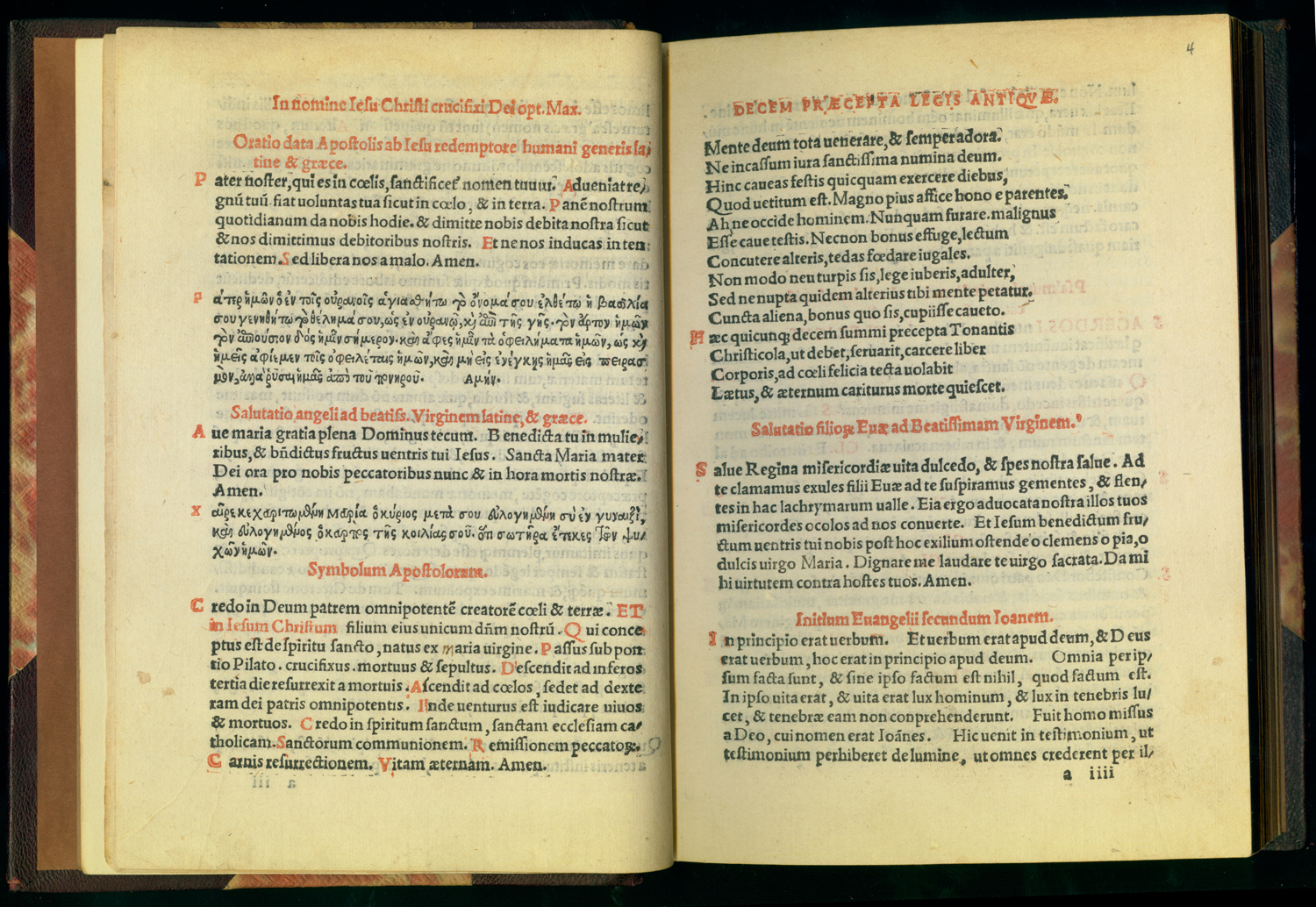
The pressmen of the Giunta firm at Florence in 1519 used a red-and-black style for the first gathering of their Aldo. These few leaves contain the prayers and the syllabary, exactly the materials that would have been given to the very beginning students in the reading course. It constituted a sort of primer, effectively separable from the rest of the book. A book printed this way may in fact have been intended to be distributed in parts. The first gathering could have been put in the hands of elementary students who would only later see the next, intermediate grammar text. For the remainder of the book, including the question-and-answer portions parallel to the Donat exercises, the Giunta employed a straightforward, all-black style, indicating that the student had now progressed to Latin study and therefore deserved to have a book in an adult style. This practice of printing a separable primer in red and black at the beginning of Aldo's grammar was carried forward by other printers, including Aldo's heir Andrea Torresano. (23) Aldo's son Paolo Manuzio dropped it in his editions of Aldo's grammar after 1558. The practice had meanwhile become mere formula, however, since as early as 1543 we find an edition printed by Francesco Bindoni where the red-and-black style is used only in the first gathering even though the syllabary, a part of the primer for which the style was introduced, runs fully four pages into the second gathering. (24)
NOTES
- Open Bibliography
- (21)Â See Haebler 1933, 127-134; Scholderer 1966, 265-270. On the De Gregori brothers and the style, Pesenti 1984, 303.
- (22) Turchini 1996, 314; Jensen 1998, 252-264; Lucchi 2000, 204-206. Lorenzo Cerreto (dates unknown) complained that Aldus's grammar, like that of Perotti, was too long and detailed for many if not most students; see Pilade 1543, fol. 1v.
- (23) Manuzio 1519a, 1519b, 1523, 1533, 1543, 1551.
- (24) The same illogical practice occurs in an edition of 1551.