7.09 Classroom Title Pages
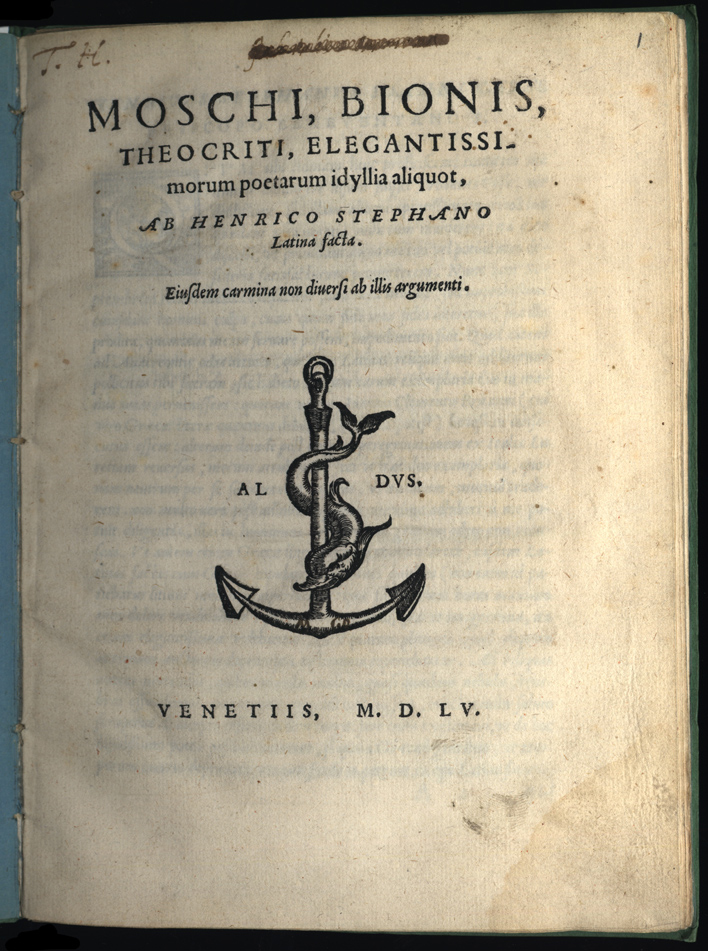
The educational power of this emblem dynamic on title pages might be clearer if we examine a few examples of textbook title pages with emblems. The most common type of title page emblem was the printer's mark, and the best known such mark is also one of the earliest, that of Aldo Manuzio, which appeared on the many school texts from his press starting in 1502. The Aldine anchor-and-dolphin mark was one of a particular sort, where the image required the compliment of a motto, in this case Festina lente ("Make haste slowly"), but the motto was never displayed along with the mark. Such emblems with implied but not stated mottoes were common and intended to add a further dimension to the puzzle-like nature of the device. In the specific case of Aldo, the mysterious mark on so many schoolbooks not only identified the products of the Aldine press, it also invited discussion and explication. (28)
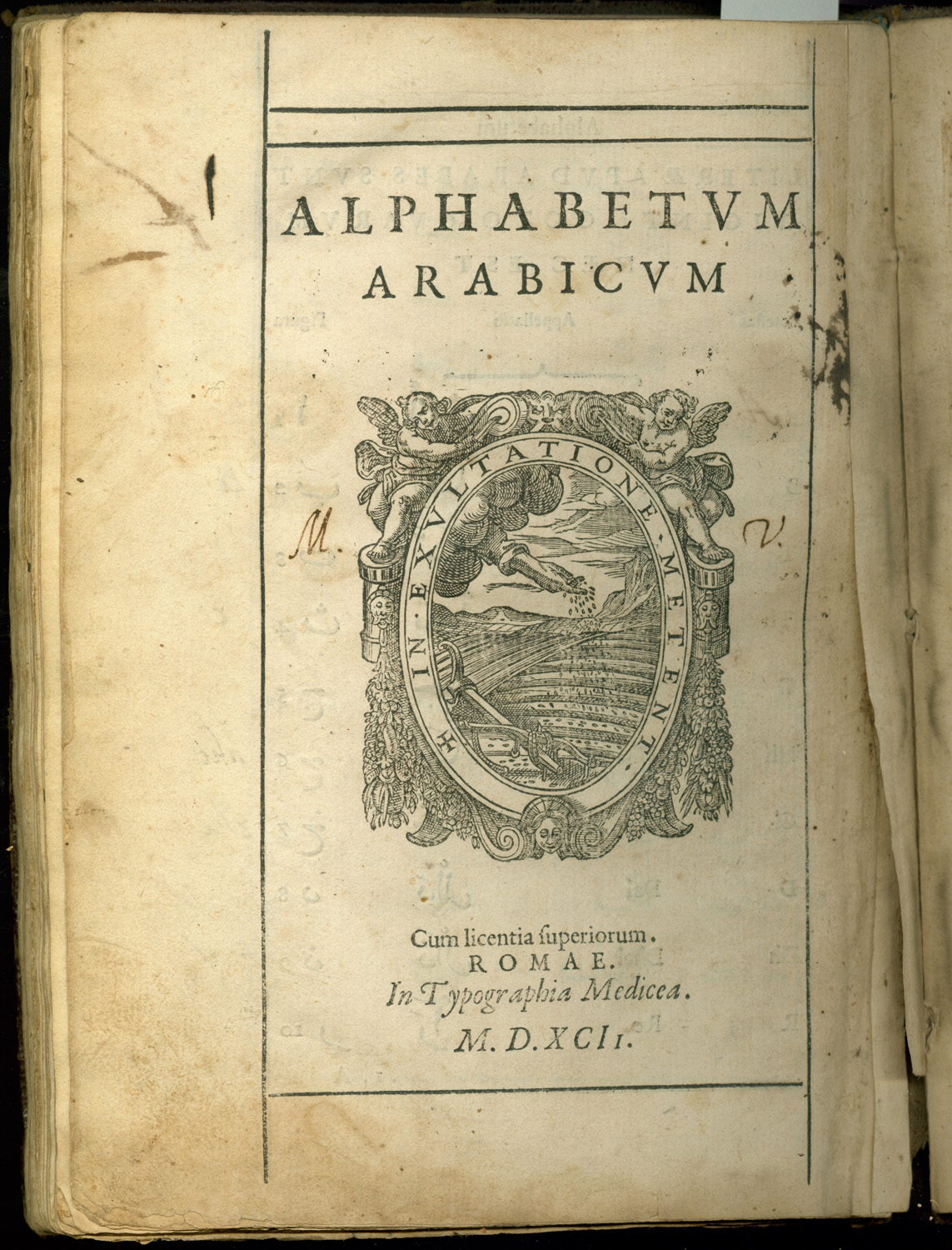
Most printer's marks were less mysterious. The typical printer chose an emblem with both an image and a motto that could be read and interpreted fairly easily. The reader had to search his memory for the classical references and he was intended to admire the ingenuity of the printer; but he was not taxed with overmuch obscurity. The mark of the Medici Oriental Press described above is of this sort. There was a great deal of visual/verbal word play in the book trade, which served in the market to commend the books to those who thought of themselves as witty.
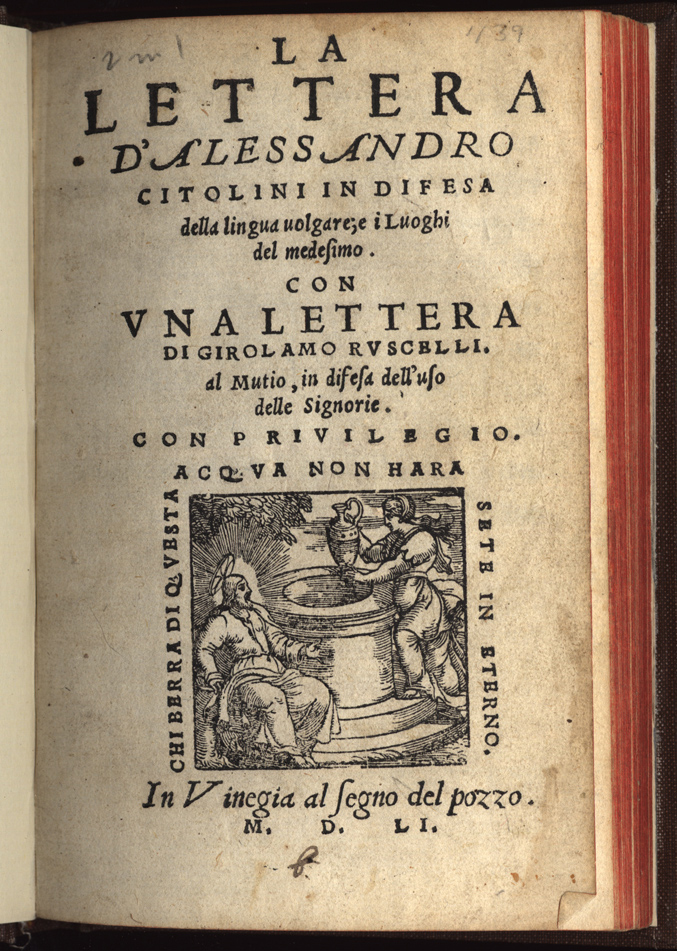
When Francesco Moscheni of Milan put a tiny fly (mosca) in the middle of a mark that concerned other, weightier matters, he was just looking for a smile of recognition. Similarly, a play on the name of the Spanish Viceroy by another Milan printer was an elegant compliment that recognized a patron. On the other hand, when Cesare Pozzo included a title page emblem of Christ meeting the woman of Samaria at Jacob's well (pozzo), he was both punning and also making a serious statement about his evangelical religious stance. No motto was needed, for Jesus's speech on the living water of salvation was one of the most quoted passages in all of the New Testament. (29)
By the middle of the sixteenth century, it was essential for printers to display marks, and emblematic marks were the most common form. Only a few genres of printed matter were exempt. In government printing the arms of a town or ruler could take the place of a printer's mark. Pamphlets or handbills with no expectation of permanence also went without marks. These were the cheapest literary products on the market -- ballads, burlesques, and simple how-to books. Inevitably, heterodox or politically radical works also lacked marks (or employed false ones). The printer's mark on all other works assured buyers of the piety, good faith, respectability, and economic stability of the press. As the century wore on, religious conformity and even Counter-Reformation zeal were increasingly embodied in printer's marks as well. (30)
Sometimes these thoroughly Christian and bourgeois qualities were not quite enough. The case of Bernardo Giunta shows how this could be so. Bernardo was a third-generation printer from a prominent family that had branches in Florence, Venice, Burgos, and Lyon. He headed the Florence house from 1517 to 1551. All the Giunta affiliates used some form of the fleur-de-lis as their mark. It was the device of the Florentine Republic, and so displayed their pride in Florence as well as in their family traditions. The lily was not in itself an emblematic device. It represented a slightly older tradition of printer's marks, closer in design logic to a coat of arms or a traditional merchant's hallmark. Bernardo himself, however, favored a version which had been transformed into an emblem. His lily was supported by two putti holding vines emerging from a vase; the sometime motto was Nil candidius ("None more brilliant" or "None more famous," in effect, "None better"). This mark had moral and literary pretensions but it could as easily be read as pure advertising, a sort of product endorsement.
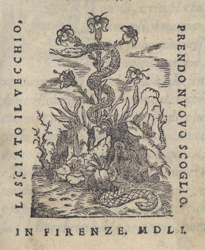
Apparently, Nil candidius did not suffice for Grand Duke Cosimo I (1519-1574). He wanted Florence's oldest and most productive press to work to the highest standards of scholarly printing in Europe. With his sanction, the court poet and cultural impresario Vincenzo Borghini (1515-1580) pressured an aging and apparently reluctant Bernardo to acquire better type and equipment and to adopt a new, emblematic printer's mark devised by Borghini himself. The new mark would conform to the highest expectations of emblematists and the greatest pretensions of printers. With it, Borghini and the Duke exhorted still greater effort from Bernardo and advertised Florence's claims to be a European cultural capital. From 1547 until his death in 1551, Bernardo's title pages displayed a finely wrought image of a snake shedding its skin between two rocks. Behind and above the serpent rose an elegant, naturalistic lily to reflect Giunta tradition. But the motto, Novus exorior ("I arise renewed"), referred only to the snake. In Borghini's own words, the motto "yields the meaning of a book that with extreme care and labor, as if rubbed between two stones, has left behind the skin of old errors and negligences that once weighed it down." For his compliance, Bernardo was rewarded with a noble title, but his heirs continued to use the new device only until 1559. Thereafter they reverted to a stylized fleur-de-lis more in keeping with family tradition. (31)
NOTES
- Open Bibliography
- (28) Renouard 1834, 410-419; Wolkenhauer 2002, 165-185.
- (29) John 4, 7-26. These devices are explicated in Stevens and Gehl 2003, 275-277 citing the pertinent earlier literature.
- (30) Pinkus 1996, 43-45, 130; Sandal 2003, 589-90.
- (31) Bertoli 1999, 89-93.