1.10 Giovanni Griffio & Co.
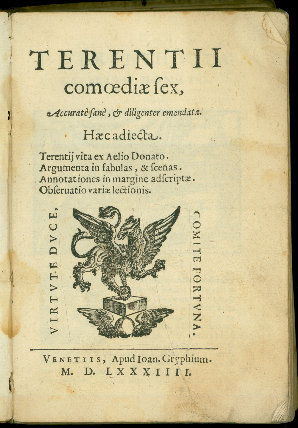
By far the most prolific publisher of octavo Terences in the late sixteenth century was Giovanni Griffio the Elder. The Griffio printing family of Venice produced at least thirteen octavo editions of Terence between 1555 and 1590, standardized to 175 printed leaves. The exact history of the family is unclear, but the elder Giovanni Griffio printed from 1544 to 1576 in Venice, and in Padua as well from 1555 to 1563. He was succeeded by unnamed heirs who printed in 1576-77 only, and then by another Giovanni Griffio, probably his son or nephew, who was active from 1577 to end of century. The elder Giovanni established a basic format for Terence in 1555 and reprinted at least nine times before 1575. His heirs reprinted again in 1576. The younger Giovanni reprinted at least four more times.
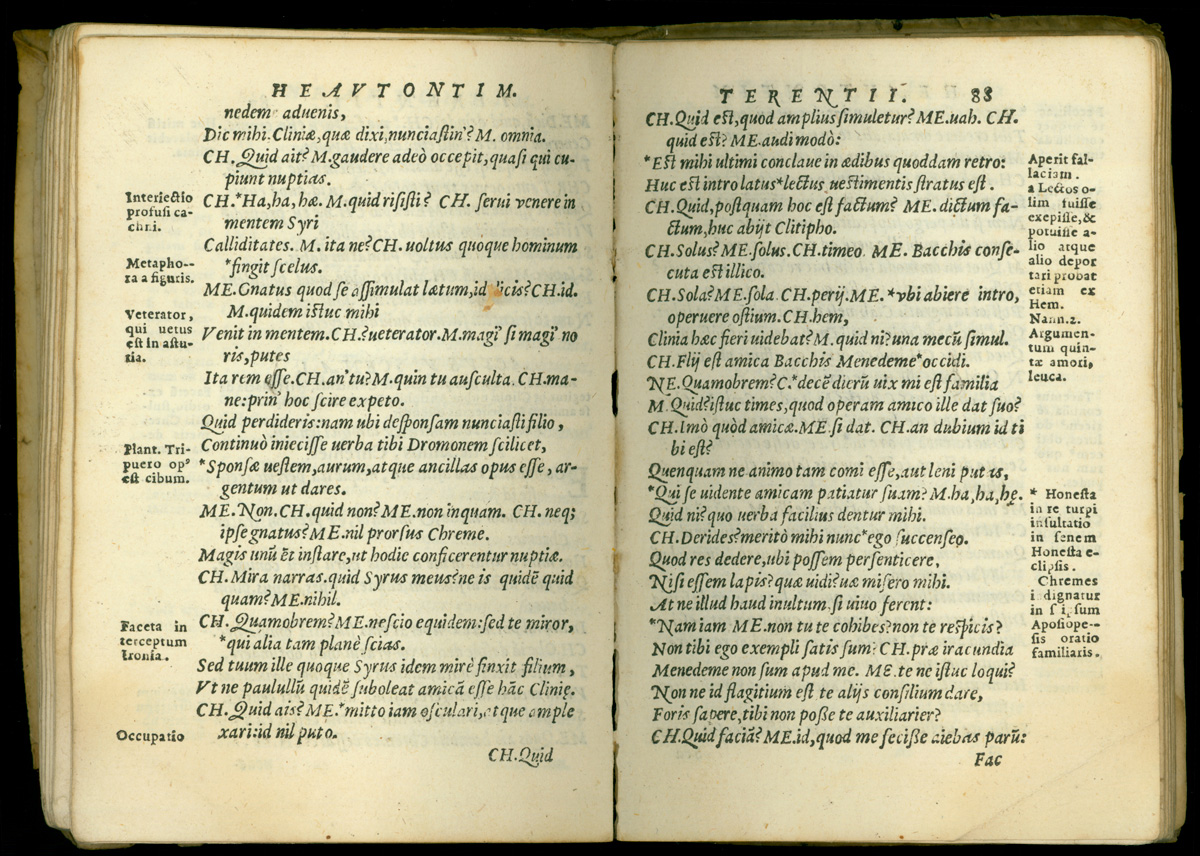
The Griffio octavos did not take their inspiration from the formatting of contemporary Aldines, nor did they reprise the text or austere typography of earlier Aldines. Instead, their design was self-consciously busy and cluttered, as if a homely page were just the right look for a schoolroom text. In this regard, they almost seem to be imitating the crowded 12mos and 24mos offered earlier in the century, taking their start from a look that was originally enforced by the tiny page and importing it back into the slightly more spacious octavo. Their text was that of Portuguese humanist Antonio de Gouveia, whose extensive commentary was first printed in Italy by Girolamo Scoto in 1545. In the Griffio octavos, selections from the Gouveia apparatus were offered. Each scene was provided with a prose argument, delimited by a title in all caps and variously set in tiny italic or roman type, depending on the edition. Numerous marginalia crowded into a clearly defined note column at the outside margin of each page. The verse forms were de-emphasized by the layout because the names of the characters, abbreviated to one or two capital letters, are set into the lines to regularize the left margin, and because the page is so crowded that it almost looks like prose.
The Griffio printing house set the type for each successive edition anew, usually reprinting on a line-by-line and page-by page basis. This was the elder Giovanni's general practice from 1555 to 1571 and his heirs resumed the practice in later editions. Such close reprinting would have saved on typesetting costs and recommended the new editions to teachers familiar with older ones. The practice was largely maintained even through a major change in the basic design of the book in 1575. Despite the economies realized in reprinting, however, the text was not entirely stable even within the Griffio house. The elder Giovanni usually named the editor on the tile page, with a phrase like "œornamented with the annotations of Antonio de Gouveia." (50) It may be that the printer was proud to have introduced the editorial work of this prominent Portuguese humanist to the small-format Italian market. He certainly thought of the claim as a marketing tool. After the older Griffio's death, however, his heirs dropped this advertisement in favor of a simpler description for the same material, "œwith marginal annotations." (51) The explicit mention of Gouveia actually disappeared on the title page of 1575, the last edition during Giovanni the Elder's lifetime; but since this edition appeared in the year of his death, it may be that the design, which is very different in other ways from earlier editions, was out of his hands. It is surely significant that the usage of seven editions should disappear just in the year of his death, and that the typography of the book should change so distinctly at the same time.
Already in 1567 the elder Griffio had begun to experiment with the placement of the critical apparatus on the page. While for the most part still reprinting page by page, he moved some of the front matter around and deleted Gouveia's notes on meter from the marginalia (opening up the page a bit). In 1575 these metrical indications reappeared in small type with the arguments at the start of each scene (just as the author Gouveia's name disappeared from the title). From 1575 onward, moreover, the book was illustrated, but the woodcuts were purely ornamental. There was a conventional portrait of the author at his desk at the start of the introduction (the standard Life of Terence by Aelius Donatus) and thereafter each of the six plays begins with the same conventional cut of a single actor representing the Prologus on a large Renaissance stage with a crowd of onlookers in the pit. (52) The most important departure of the 1575 and 1576 editions, however, was a decision to frame each page with typographic rules that also separate the field of the text from the column of notes. These ruled borders did not really clarify the organization of the information in any way and they cluttered the overall page even more than the earlier format had done. The rules were abandoned for the editions of the fifteen eighties and nineties, perhaps in the hope of achieving a more spacious look. From 1575 onward, however, the firm maintained its line-by-line reprinting and made no further editorial changes.
NOTES
50 Terence 1567b, 1569b; compare Terence 1555b, 1557, etc. 51 Terence 1575, 1576. 52 The block is similar to one of the Prologus that appears in the influential Scoto and Bonelli editions (Terence 1545 and 1561). On the blocks see also Rozzo 1998, 120-121.