1.06 The Folio Terence
The earliest Italian editions of Terence were handsome, straightforward and relatively unadorned folios (or more rarely, large quartos). These mimicked the folio manuscripts in humanist script that had already set the format for this text in Italy. Teachers and printers seem to have agreed that this essential school book deserved a handsome dress worthy of a classical author, but they were equally of one mind that it should not be ornamented overmuch. The six canonical plays run to about 6,200 lines of verse, fewer than 100 leaves when set in largish type (typically equivalent to14 point or slightly larger) generously leaded and with wide margins. The commentaries widely available in manuscript (and therefore to the first printers) bulked up the text considerably; but still the usual folio Terence with the late ancient commentary of Aelius Donatus in smaller type surrounding the text (called Terentius cum Donato) was a fairly slender volume of about 120 leaves. Such books were edited in the manner of scholastic texts of the Middle Ages; they represented manuals for teachers and introduced advanced students to the forms of text usual in university-level study.
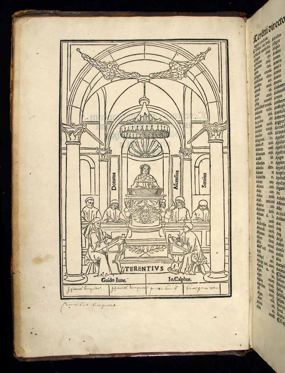
Because the plays were so often recommended for school use, however, they also attracted new humanist commentaries, which appealed to printers as added value in a competitive market. Indeed, we may well call the first thirty years of Terence in print the age of commentary. So we find such titles as Terentius cum duobus commentis or Terentius cum quattuor commentis. By the end of the century Venetian printers could offer Terentius cum quinque commentis, a standard collection with the commentaries of Donatus and Servius from the ancient world, and those of humanists Giovanni Calfurnio (d. 1503), Guy Jouenneaux (d. 1507), and Josse Bade Ascensius (1462 "“ 1535). (32) This collection reflected the internationalism of the school use of Terence, for only one of the humanist commentators was Italian. The others were Northerners first published in France and imported by Venetian printers in the fourteen nineties to enhance the competitiveness of their books. Needless to say, five commentaries printed in parallel alongside the base text vastly enlarged the book. The late-century folios of this type often run to 250 or even 300 leaves with printed matter crowding out to the limits of the margin. Editions of the text without commentary virtually disappeared, though some printers at the end of the century continued to offer the slimmer format of Terence with a single commentary, usually that of Donatus.
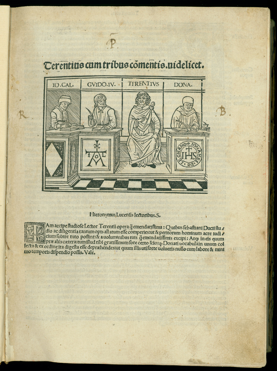
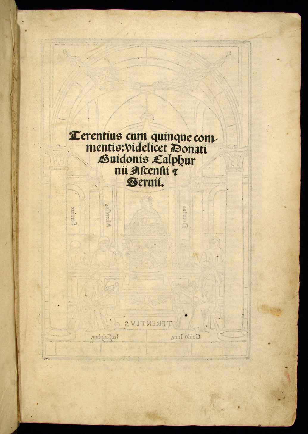
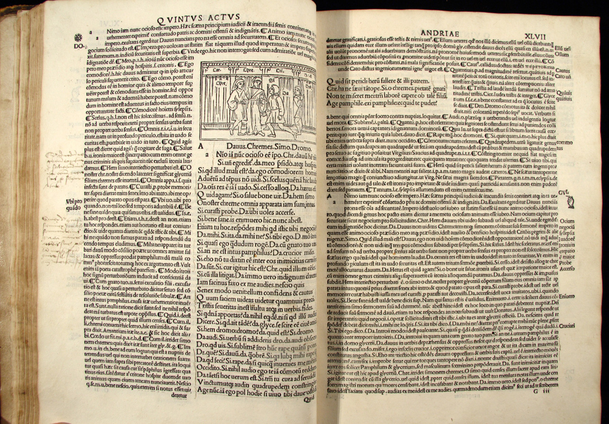
Commentaries were increasingly part of the marketing strategy of printers. As early as 1474, a Neapolitan publisher also decided to highlight the humanist editor's work in his title: "Terentius Afer of Carthage revised from other editions and corrected by comparison with several ancient manuscripts by praiseworthy poet Angelo Sabino." (33) The publisher vaunted the work of Sabino (ca. 1450-1510) as that of a humanist with access to ancient manuscripts. This glorification of editors and commentators eventually found expression in the handsome title pages and frontispieces that appear in editions late in the fifteenth century. They show Terence lecturing from his professorial cathedra surrounded by admiring disciples making notes at desks, each labeled with the name of one of the commentary authors. The humanists presented themselves in these images in scholarly conversation with an ancient author. (34)
In the first half of the sixteenth century the number of available commentaries expanded again. To the names we have already mentioned must be added brief or thorough notes by Pietro Marso (1442-1512), Desiderius Erasmus (1466-1536), Bartholomaeus Latomus (1485?-1570), Adriaan van Baarland (1486-1538), Heinrich Glareanus (1488-1563), Philipp Melanchthon (1497-1560), Johann Rivius (1500-1553), Antònio Gouveia (1504-1565), Etienne Dolet (1506-1546), Georg Fabricius (1516-1571), and Theodor Poelmann (1510-1607?). Like earlier commentators, most of these writers were teachers and they came from all over Europe. (35) In order to reflect all this additional apparatus, page layouts became more intricate and title pages got increasingly detailed in their marketing claims. Glareanus, writing in 1540, expressed no small exasperation at the state of Terence in print:
Concerning [Terence] today, there are so many commentaries recently printed, so many annotations, such a patched-together mosaic-work that it could appear singularly shameless to compose more. And yet...very little [of what is in print] will prove to be of any moment, while much of it instead is inept and falsely published. (36)
Glareanus had the exaggerated claims of publishers in mind as well as the work of the annotators and editors.
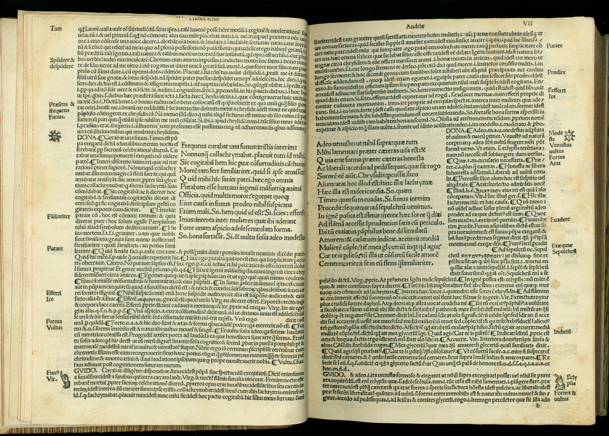
Through most of the incunable period, Italian printers favored setting Terence in the usual medieval and early humanist form of text-with-commentary. They would lay out each double page spread with the base text occupying a window at the inside center, one column on each side of the inner margin or gutter. On each page the window was surrounded on three sides by commentary and the overall effect of the double-page spread was that of a framed picture or a carpet with a central medallion.
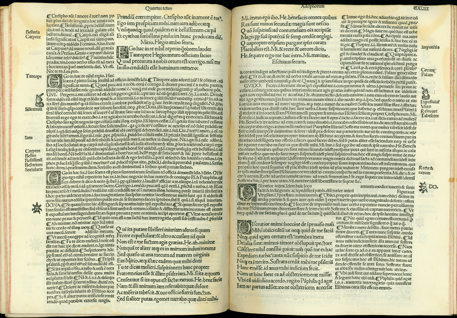
When the commentary was long, the corresponding text was fairly short so the commentary filled the page; the double-page spread appeared to have a single small window and a broad frame. In cases with less commentary, the inner window of text could be enlarged relative to the frame. And when the base text was particularly long in relation to the commentary, the format dissolved into a four-column layout with the commentary occupying the outside columns on each spread and the base text in long columns at the center.
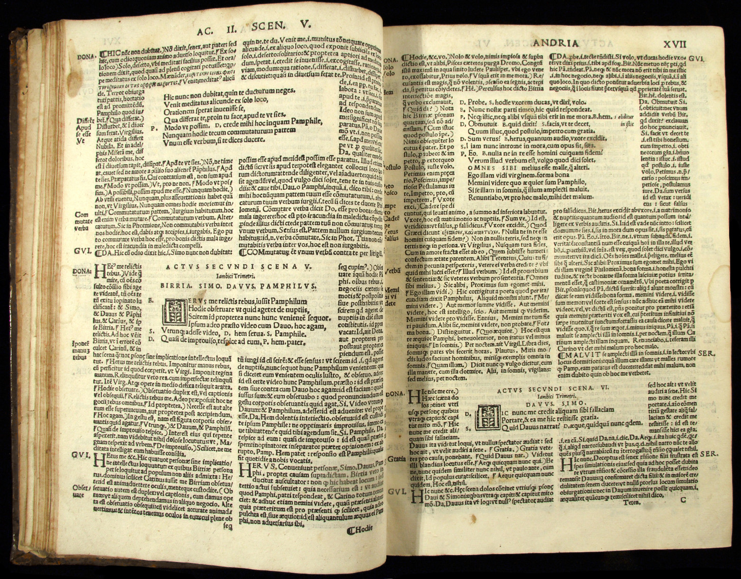
Starting about 1495, especially in editions with four or five commentaries, some printers of Terence favored an alternate layout, also based on manuscript models, with a window centered on each page and commentary on all four sides of the window. In such a format, the double-page spread appears to have two windows within the commentary frame. Since the text of Terence also breaks into acts and scenes, this layout not rarely produced double-page spreads that have three or even four distinct windows floating like islands in the commentary. Eventually, printers would abandon the medievalizing windows entirely and resort to a simple two-column-per-page format, alternating text and commentary in each successive column. In all these formats, the base text was set in larger type than the commentary and leaded more generously, so that the two hierarchically related blocks of text were sharply distinct.
NOTES
- Open Bibliography
- (32) Terence 1501; Rhodes 1988, 287.
- (33) Terence 1474. On Sabino as editor, Blasio 1986, 487-489.
- (34) Soardi editions from 1493 to 1508 have such a cut with five commentators; the Scinzenzeler of 1501 has a similar image with three commentators. The woodcut blocks could be modified for successive editions to indicate different numbers or different combinations of commentaries, Petrella 2006, 161-163.
- (35) Lawton 1926, 291-309; on Rivius, Saxenberger 1886; on Gouveia, Carvalho 1916.
- (36) Lawton 1926, 306-07: ... in quem tot extant hodie iampridem edita commenta, tot annotationes, tot assuta emblemata, ut singularis impudentiae vederi possit in eundem plura conscribere. Atqui ... comperiet sana pauca alicuius momenti, multa inepta, multa perperam prodita. This pessimism in 1540 contrasts sharply with the optimism about new philology in print expressed a generation earlier by Marcello Virgilio Adriani (1464-1521); see Godman 1998, 177-178.