3.12 Impressing the Printers
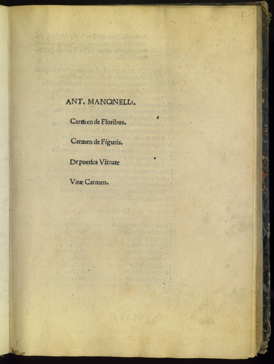
While at Venice, Mancinelli tackled two other publishing projects, both aimed at rounding out his offerings of textbooks on the Venice market. For the grammar course he prepared On Verse Virtue (De poetica virtute), an anthology of classical poets' sayings about the virtues and vices. It begins with a selection of their praises of poetry as a morally uplifting genre. It first appeared in print in Venice in late 1493 with the Carmen de figuris and Carmen de floribus, and in 1495 it was printed as a separate in Rome. It never appeared in this latter form again, but continued to be published at Venice alongside other small works on verse composition. (58)
Mancinelli's second new textbook of the period was How to Speak and Write (Scribendi orandique modus). This is a brief, systematic treatment of rhetoric, starting with nine short chapters on letter writing, continuing with a discussion of public speaking in seven chapters, followed by three chapters on education in general. A final chapter, really an appendix, offered vocabulary useful for speaking and writing, in the form of an anthology of vocabulary distinctions (differentiae). In Mancinelli's mind the Scribendi orandique replaced the briefer compositional rhetoric he had composed in the 1470's called De oratore brachylogia, the contents of which are recapitulated in the chapters here on letter writing. Mancinelli, then, followed a pattern we have observed on other occasions. He revised and expanded works first published in brief form, or he returned to a subject from another point of view (or in verse instead of prose), or he created an additional anthology of texts on a given subject from ancient authorities. In the case of the *Scribendi orandique *modus, he actually did all three of these things. (59)
The preface of Scribendi orandique modus is dated at Venice in June 1493 while the printing of the first edition is dated July 10, 1493 at Venice. Mancinelli mentions in a letter that he returned to Velletri from Venice in mid-July that year, so it is almost certain that he saw this edition through press just before leaving. A second Venetian edition followed, probably in 1494, and others appeared between 1496 and 1500. At least five different Venetian printers published this work within a decade of its appearance. All this activity suggests lively interest on the Venetian market for works by the Roman humanist. The work was never printed at Rome but it had a considerable fortune beyond Venice, with multiple editions before 1500 at Milan, Ulm, Leipzig, and Paris.
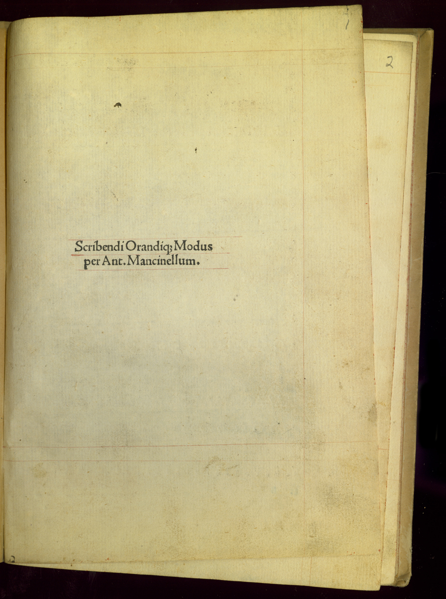
More than any other work of Mancinelli, the Scribendi orandique modus has a distinctive typographical dress that is preserved through all the early editions, and which we may ascribe to Mancinelli's own influence, since we know he was present in Venice during the printing of the first edition. The printer Simon Bevilacqua had not worked with Mancinelli before, though he later printed other work from the humanist's pen. Most of Mancinelli's early works appeared with multiple titles on the title page, and often with a brief advertisement composed by Mancinelli or the printer. Scribendi orandique modus, by contrast, almost always appears with a chaste title page that includes the author and title and no other information. The invariable form is Scribendi orandique modus per Antonium Mancinellum.
.jpg)
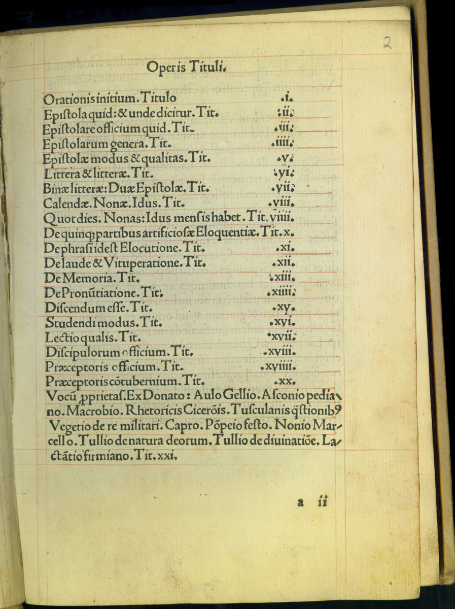
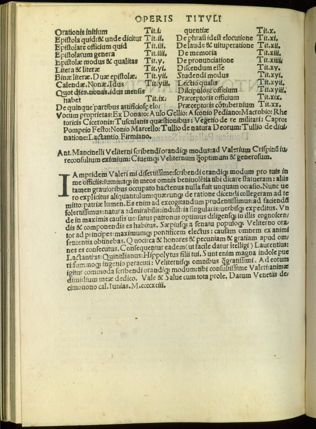
The Bevilacqua first edition is particularly spacious. The verso of the title page is blank and the entire recto of the second leaf is taken up by a table of contents, classically described as Operis Tituli. This page has a clear, tabular form for the first twenty chapters, and the page is footed with a paragraph-form description of chapter twenty one, the vocabulary. This last entry, called "The Proper Meaning of Words" (Vocum proprietas), names fourteen source texts for the lexicon. This distinctive form of contents listing indicates that Mancinelli viewed the last chapter as a sort of appendix, essentially a separate composition, and one that took its value from the list of important classical authorities on which it drew. Printers from the first edition forward emphasized this distinction by setting the text of the first twenty chapters in a single broad column in a large roman type and the last chapter in two narrow columns in much smaller type. (60)
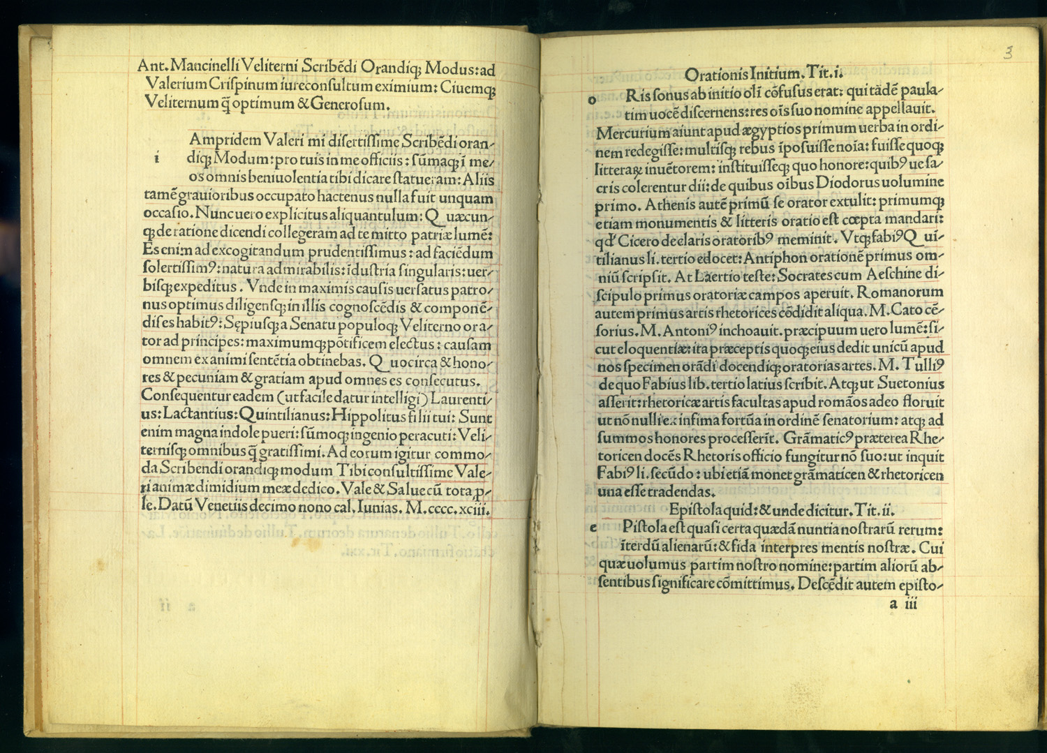
The table is followed by a dedicatory letter to Valerio Crispiano of Velletri that occupies another entire page, so that the actual text of chapter one only begins on page five, a striking degree of spaciousness in a schoolbook. The dedication, moreover, is entirely ceremonial and makes no reference to the specific content of Scribendi orandique modus except to commend the dedicatee for oratorical skills he regularly displayed in the city council of Velletri. Since we know Mancinelli was on his way back to Velletri in July of 1493, and since he tells us elsewhere that within three days of his arrival the city fathers offered him a position as teacher there, it may be that this last "Venetian" work was really intended to mark, and to celebrate, his homecoming to small-town Lazio after two years in the North. Without too much license, we may imagine Mancinelli crossing the Apennines with a saddlebag full of elegant little textbooks for friends and notables in Velletri, some already bound in the latest Venetian styles.
The typography of the Scribendi orandique is striking and original. Despite the small types typically used, it achieved an elegant look, based on the best small humanist manuscripts of school texts. In this respect it mirrors the equally distinctive layout of the Lima in Vallam, another text we know was composed and typeset during Mancinelli's last months in Venice. We can only assume that Mancinelli's own preferences are at work, together with the technical versatility of the presses at Venice, and perhaps the schoolmaster's increasing sensitivity to type and the possibilities it offered.
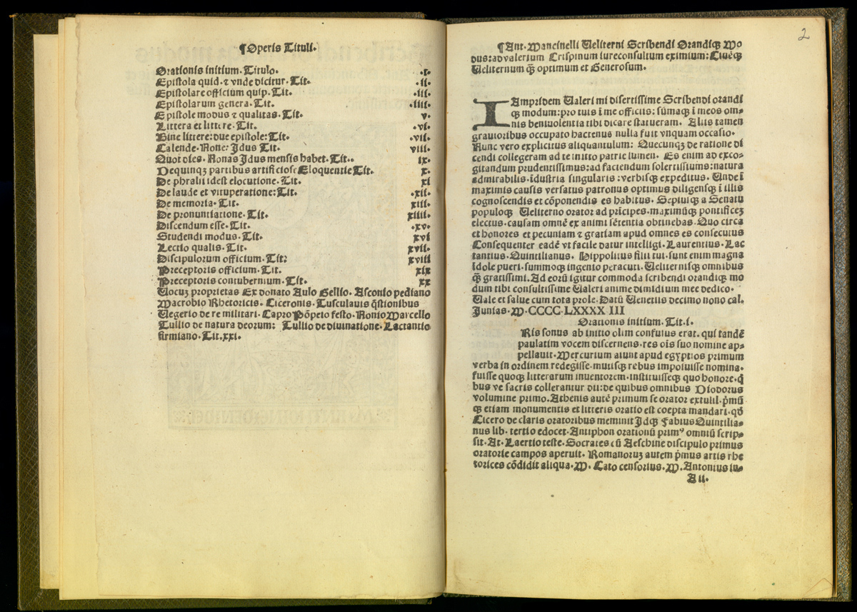
Even in the collected editions of Mancinelli's works that began to appear about 1500, the Scribendi orandique modus retained its characteristic typographical dress. In the 1519 collected works, for example, it is compressed, like the rest of the booklets in this unlovely omnibus. So the title has lost its blank verso; and the table of contents and dedicatory letter are squeezed onto a single page. But the unusual order and the layout of the table are followed, and the change of type and format at the beginning of chapter twenty one is observed. The title page retains its single-line title, and is elaborated only slightly by the addition below of a two-line verse in praise of Mancinelli. (61)
.jpg)
Northern European printers were less likely to preserve the chaste Venetian title page style, but they did follow the basic layout of the Scribendi even when it was at variance with their own house style. Antoine Denidel at Paris used a tiny, homely gothic type but followed the page layouts of his Venice models; Johann Schäffler at Ulm followed his Venetian models even more closely but substituted a pretty, relatively spacious gothic type. (62)
NOTES
- Open Bibliography
- (58) Mancinelli 1498c.
- (59) Mellidi 2002, 127-130.
- (60) Booklets of differentiae posed particular layout problems because the lists of words were often wasteful of valuable paper. One solution in sharp contrast to Mancinelli's was to fill the inevitable blank spaces with ornamental cuts, as did the printer of the 1549 Guarino differentiae described by Bersano 1966, 300-302, and ascribed by Malaguzzi 2004, 97 to the Mondella family press. The result was, as Malaguzzi remarks, aesthetically at variance with any typographic norms; but, since this printer was capable of more sophisticated work, we must also conclude that the odd, fussy look of these pages was deliberate attempt to appeal to the children's market in a provincial town. This one-of-a-kind book probably represents many similar, "naïve" products that do not survive.
- (61) This epigram had migrated to the Scribendi orandique title page from that of Mancinelli's Lima in Vallam and Rhetorica ad Herennium. The Vocum proprietas chapter went on to have a life of its own, distinct from the main part of the treatise, as one of many humanist treatises on differentiae.
- (62) Mancinelli 1499c, 1499d.