1.09 Octavo and Smaller Formats
Still, the fact of these rare quarto experiments calls into question the commonplace of bibliographical history that the Aldine octavo was the inevitable "œbest" format for poetry. It is true that the largest number of editions of the text without commentary were octavos and that Aldo pioneered that format. But if we look more closely at small-format Terences, we can see that even when other printers imitated Aldo's achievement they often chafed at the limits of the Aldine format. This was especially true in the case of complex dramatic texts like Terence where the frequent scene changes and indications of character made for complicated layouts. Terence in fact was a latecomer to the Aldine list. Aldo himself had planned a small-format Terence but the first Aldine octavo edition appeared only after his death. Not entirely independent of Aldo's experiments on the octavo, then, but essentially different in meaning and expectations were a number of attempts to present Terence without commentary in extra-small formats -- 12mo, 16mo, and 24mo.

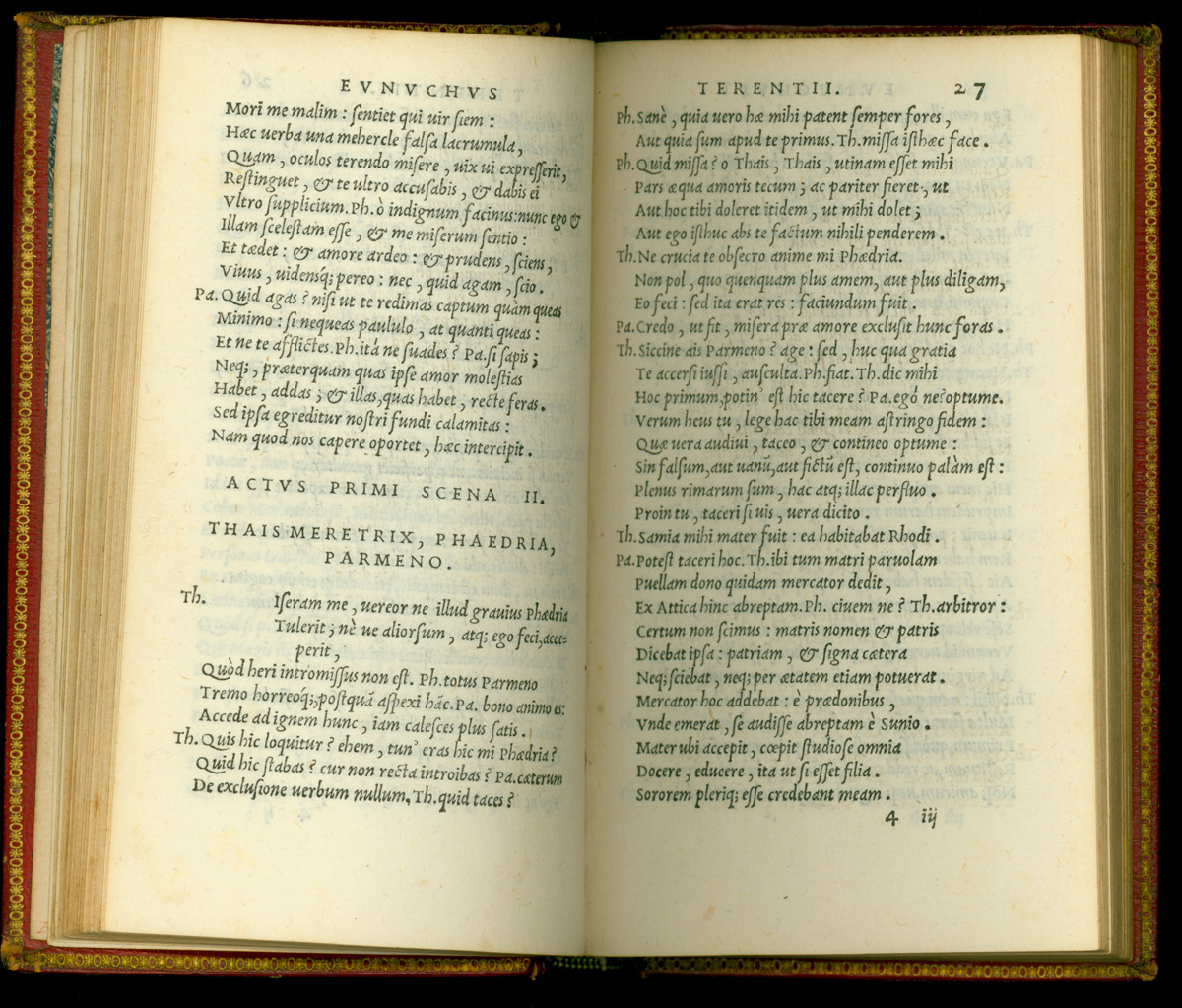
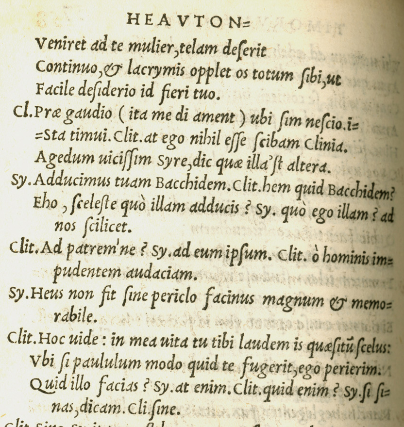
In a classic Aldine format, the text of Terence appeared in long columns on the abnormally tall and narrow Aldine octavo page. Aldo and his heirs tolerated no marginalia, and the severity of such a scheme created problems for dramatic texts. In the Aldines, only the indications of scene change (centered in all caps) and the names of the speakers (abbreviated and hung into the left margin) were permitted to violate the strict march of the poetic lines. Indeed, the tightness and austerity of the format was emphasized by hanging the character indications exactly two letters' width into the left margin.


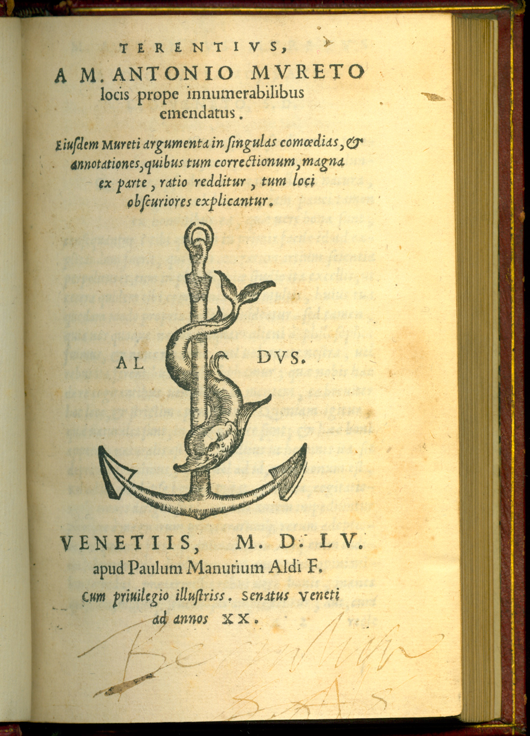
Whenever possible the names were abbreviated to two characters. When it was absolutely necessary to have three or four letters to differentiate characters, the line beginning is indented so that the name will not extend further into the margin. This basic page layout was retained by the Aldine press into the fifteen eighties. The 1517 first Aldine edition presented a text which had been worked up by Aldo himself and was finalized for the press in the year after Aldo's death by Gian Francesco Torresani Asolano (1498-1557?). (45) Many competitors of the Aldine press adopted this text wholesale and later editors adopted it as a starting point. It remained the basic text for Aldine editions until that of 1553, when Paolo Manuzio corrected it for a new edition. This must have seemed too little change in a market crowded with more recent scholarly editions, for Manuzio turned to Marc Antoine Muret (1526-1585) to edit an entirely new Terence only two years later. But the formatting remained largely the same through these changes of editor and through many subsequent, corrected editions of Muret's text. (46)

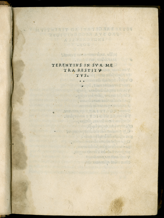
The power of the Aldine model may be observed not only in that press's own publications but also in the usage of its imitators. The Giunta press at Florence began to print Terence in octavo in 1505 and presented the text in an Aldine style. (47) This was a patent attempt to beat the Aldine press to the school market with a small-format Terence. The page size was a more normal octavo shape than Aldo's, but the typography is Aldine in the extreme. Especially notable is the Giunta title page, on which Filippo Giunta ignored all other typographical standards and gave the author's name in a severe all-caps triangle that reflects the earliest Aldines. [TERENTIVS IN SVA ME / TRA RETITTV / TVS / [two dots] / [one dot]] The colophon is equally austere and the book attests the degree of admiration the earliest Aldine octavos evoked. The Giunta press abandoned the Aldine model entirely after 1565, at the same time they turned to a new editor for a small-format Terence with apparatus. Aldo's in-laws, the Torresani family, on the other hand, retained the original, severe formatting for editions of Terence until 1570.
One of Aldo's greatest admirers was the same Alessandro Paganino who experimented with a quarto Terence in 1526. Paganino issued a series of books in an entirely new format, the 24mo, between 1515 and 1525. The series was both modeled on and intended to rival the Aldine octavos. One such 24mo was a Terence that appeared in 1516 (but is mistakenly dated 1506 in its colophon). It is worth comparing it to the first Aldine Terence, which appeared in the next year. Paganino's title page was "Aldine" in its severity, reading simply TERENTIVS IN SVA / METRA RESTI- / TVTVS (following the Giunta title pages of 1505 and 1509). Such purely typographic titles, in fact, imitated the earliest Aldine octavos, those from 1501 to 1505 that appeared without printer's mark, and not the more developed form that was normal by 1516. (The 1517 Aldine would appear with the single word TERENTIVS and the Aldine anchor on the title page.) Also like the Aldines was Paganino’s choice of an italic type for the poetic text, set flush left with only the names of the characters protruding into the margin. Paganino’s books, however, were so small that they seem almost like toys, and the type had to be reduced proportionately. (48)
Paganino had taken up some Aldine ideas but did not merely copy them. At its origin, the Aldine octavo was an imitation of graceful, small, late humanist manuscripts. As Angela Nuovo remarks, it was a bit of a step backward in book-history terms because it looked to manuscript models rather than building on the traditions already pioneered by and for print. Certainly its models were retrospective. But as Nuovo has also shown, this was not the case for the Paganino 24mos, which represented both design and production models that were purely typographic and without precedent in manuscript culture. They required immense mechanical precision, depended on highly skilled type founders and typesetters, and employed an imposition scheme that required handling the type forms and sheets more carefully than ever in the past. (49)
NOTES
- Open Bibliography
- (45) Cataldi Palau 1988, 83-85, 336-341.
- (46) On the typographical conservatism of Paolo Manuzio, see Baldachini 1994, 286-288.]
- (47) On the humanist publishing program of the Giunta, see Godman 1998, 207-217.
- (48) Balsamo 1969, 18-22; Nuovo 1990, 36-62.
- (49) Nuovo 1990, 39 is right in this judgement, notwithstanding the contrary opinion of Stanley Morison, Morison and Day 1963, 32-34.